Tuesday, 28 October 2014

October Challenge by Meili Paperie


HELLO EVERYONE!

So I saw the picture below posted by Meili Paperie for their challenge and it gave me loads of inspiration. I really liked the color combination in this photo and how orderly all these umbrellas were arranged at the beach.


I'm going to bring you through my thought process of how I create my layout. 

I started with a piece of patterned paper from Bluefern Studios. I really LOVE LOVE LOVE their papers cos it's really thick, the grammage is higher than most of the brands out there, make it really nice to use with mediums as the paper will not warp so easily. 

SEE HOW PRETTY! Had a dilemma which side to use.
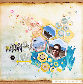
Anyway, so I chose the side on the right coz the pattern is less 'busy'. I also began to think of how I can reflect the neatness given in the Meili Paperie picture. I decided to pull out my hexagon triplits dies by Sizzix and die cut them using my Big Shot Machine. 


The thing about hexagon is that no matter how messily you arrange them, as long as the edges match, they'll still look orderly somehow cos they are symmetrical. So this is the direction I am going as I'm not a orderly person, I'll probably never be able to come out with something as neat as the umbrellas in the picture so this layout will be what I call 'the neat meets the messy'.


I die cut out some hexagons with printing paper so to figure out the placements of things, and I realised I probably need a more striking background for contrast so I mixed some Kaisercrafts acrylic paints with my Teresa Collins Modeling Paste and just swipe them over the paper with my palette knife so as to create some texture and some dimension. I also splattered some dylusions ink over top in Vibrant Turquoise and Pure Sunshine colour.
So the colours I used were tropical water and mango.

And it looks like this after it dries

So I tested out the placement again.

Then I started choosing my papers and die cut them. I layered my photos with some patterned papers and noticed I change my placement of hexagons? Haha. I guess I just any how mix and match and I didn't bother to follow the one I placed before. I also pop some of them up with dimensional adhesives and die cut some extra hexagons with glitter papers. I also added some stars wood veneers and dew drops by The Robin's Nest.


Originally, I had planned to stick the blue hexagons to the blue area and yellow hexagons to the yellow area as it makes much more sense looking at the umbrella picture cos it'll look neater. But after testing out the placement, I realised that if I switch them, they would stand out more as there's a contrast. I guess this is also part of my 'messy' personality. Haha.

Here are some of the close up looks:


Sorry I can't remember where these papers are from cos they're too old. They have been in my stash for too long.

To add some details and highlights, I used my fingers to gesso the borders of my photos, and then I decided I should do the same for some of the hexagons and stars as well.


I also decided to add Tim Holtz Distress Stickles Clear Rock Candy to the modeling paste at the background to add some shine to the project. I thought that the blue modeling paste is sorta mimicking the sea and the yellow modelling paste the sand. So by adding stickles to it, it creates this kind of grainy shine to it and I thought it makes the sea and sand more genuine. I would have used clear gel if I have for the sea, and white sand texture paste by Finnabair to make it even more realistic if I have those supplies. Oh well, I need start saving up since I wanna get a lot of new things. Haha.

See the shine in the blues??? So pretty. :))

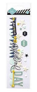
I have also decided to use Heidi Swapp embellishments for my sentiment since Meili Paperie is giving out Heidi Swapp items as prizes. Fit the theme eh?

I decided to cut them down so that they'll fit my layout and I took the rest of the stars and hexagons stickers in the pack to decorate my hexagon clusters.


I then decided to trim off the top of the blue fern studios paper and layered it with a kraft cardstock at the bottom. Before I stick it down, I tore off the edges of the paper and using my Tim Holtz mini blending ink tool with the Vintage Photo colour, I distressed the edges of my paper. I also added some dotted lines with my white pen on the kraft cardstock as finishing touches.

THEN...TADA!!!

This is the final look of this layout for the Meili Paperie Competition.


I hope I get to win this competition. Haha. And I also believe this is my first time taking up a scrapbooking challenge. 

Thanks Meili Paperie for the chance and also giving the inspiration to create this layout. :)

The details of the competition are (copied directly from the blog haha):

- You can submit ANY kind of project that you were inspired to create such as layouts, cards, project life fillers
- The winner of the prize will be randomly drawn and our 3 favourite layouts be featured on the blog. 
- Our challenge will run until November 4th at 11:55pm Hong Kong time. 
- Link your creation below by entering a link to your blog post or online gallery sharing your work.  Our InLinkz now has the ability to link your project from Instagram! so you can just snap a photo of your project and link while you share it on instagram.. so cool! 
- Please no back-linking.  This is for newly created projects only.  Any back-links will be be disqualified. 
- If you don't have a blog or online gallery, alternatively you can post a photo of your work on our facebook page. Please make sure you include " Mei Li Inspired by... Challenge" somewhere in the post. 

And to go to their page, just click here.

THANKS FOR READING!
See you guys soon! :))


Sunday, 26 October 2014

Layout for DARLING FRIEND'S BIRTHDAY!

HARLO AGAIN!

This layout is actually a REALLY belated gift to my darling friend whose birthday was long over before I had the time to make this for her. She's super sweet by baking me a birthday cake for my birthday hence I decided to reciprocate by making something I am better at --> Scrapbooking!

This is the final look of the layout.


Firstly, I prepped my white cardstock with a layer of Gesso, mainly at the centre portion as I will be applying mediums there. Then by adding a few drops of Dylusion Ink Spray to my modelling paste from Teresa Collins, I am able to create this dimensional background. 

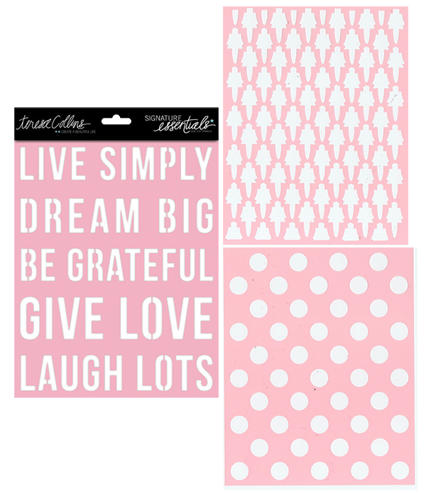
What you need to do is to scoop some modelling paste and mix it with the colour you are using and then swipe it across the stencil at the area you want the colour to be at. The stencil I used was from Teresa Collins as well. 

I then dilute the ink with a wet brush and gently watercolour it over the now-dried modelling paste and splatter some ink on top of it after everything dried. (All supplies can be found at the bottom of the post.)


Because I meant to put this in a shadow box, I want my layout to be very dimensional, I forgo my normal dimensional adhesive and go for small pieces of cardboard that I cut out from shipping boxes instead. Those are WAYY higher than normal foam dots and it gives excellent pop-up effect.

I layered my photo with a vellum from Webster's Page's Strawberry Fields Collection and also the chipboard frame from Crate Paper's Notes and Things Collection. I then added some Kaisercraft's Paper Blooms as sorta 'photo corners' cos it feels right. Haha.

If you notice, I cut out the wire that comes with the paper bloom and coiled it around a pen to create the tendril look, I guess it makes the flowers look more interesting. 


I also added some chipboard embellishment from Crate Paper Notes and Things Collection's chipboard stickers. In fact, all of the chipboard stickers I used in this layout were from that same sticker set as well. I also die cut a frame from Sizzix using chipboard and altered it to fit the theme/colour scheme and I added some burlap strings that I tore off from a piece of burlap to create some dimension and interesting element to the layout. In fact, burlap is my new best friend!!! HAHAHAHA.


I've also used Dear Lizzy's thickers by American Crafts for my title of the layout. This is a rather old collection, because I think I bought it long long long time ago. I've just managed to dig it out recently.  Hehe. But ITS SO PRETTY!!! I LOVE the clear glitter on the thickers and the colour is so sweet. :)


Then as finishing touches, I added some of these clear dew drops all over my page. THIS IS A MUST-HAVE IN YOUR SCRAPBOOK STASH! Because, firstly, it's suitable to use on all themes, be it vintage, or chic girly or masculine, secondly, it's quite cheap for the amount of dew drops you get. I would prefer using this than enamel dots because its rather inexpensive.

You can get them at http://www.shop.robinsnest-scrap.net or at Made With Love Singapore at 313 Somerset if you lived in Singapore. 

I've dripped some ink on top of the dew drop to let it flow down to the bottom to create that little circle of colour at the bottom. Make it more interesting. Learn it from a scrapper when I attended her classes. Haha. 


And here are the supplies I used

I used Bubblegum Pink, Vibrant Turquoise and Pure Sunshine. Dylusions Ink Sprays were designed by Dyan Reaveley and produced by Ranger.


Teresa Collins' Modeling Paste along with palette knife. Old credit cards will do just fine as well.
Teresa Collins stencils. Comes in set of three. 


Vellum paper from Webster's Page Strawberry Fields Collection

Kaisercraft's Paper Blooms and mini Paper Blooms in assorted colours.

Crate Paper Notes and Things Collection Frames

Crate Paper Notes and Things Chipboard Stickers (ME LOVES!!!)

Dear Lizzy by American Crafts Thickers. Can't figure out which collection cos it's been so long. 

Dew Drops by The Robin's Nest. See what I mean by inexpensive? 

Thanks for reading! Seeya!


Wednesday, 22 October 2014

Oktoberfest 2014 @ Paulaner Brauhäus Singapore

Really upset that I couldn't visit my friend in Swiss to travel to Munich together to experience the authentic German Oktoberfest!!! So I'll have to settle with the Singapore version with my cousins. It's still a pretty awesome night and I had fun (and a lot to drink).


Anyways, this is how my final layout looks like. I used mostly crate paper stuff. I think I almost bought the whole Open Road collection cos it's so pretty. #emptywallet

I started out with this typewriter-ish paper from crate paper open book collection (I used the other side of this paper and IT'S SO PRETTY!!!). I think this is really the paper to get coz you can either cut out the flowers as embellishments or you can use the flip side (like I did) and use it on any theme layout. It is quite a versatile design. :)


Then I decided to challenge myself to not use any mediums like my past projects. So I go ahead and plan out how to layout my pictures. These 3 pictures are my favourite for the night so I decided to put them side by side at the centre of the page. I also layered this paper (polka dot) at the back of the photos to give it a more dimensional look.

I then decided that I am sick of my photos being rectangle and boring so I decided to embellish the top and the bottom of the photos. I pulled out all my washi tapes and mix and match to make a banner. I have a lot of washi tapes but I have just no idea how to make full use of them. :( 


As you can see from the above picture, I also added some small tags and banners from the Crate Paper Notes and Things collection. 

Which is what I mainly used to embellish the top of the pictures too. 


Added some crackle accent from Ranger because I got itchy fingers and can't stop. 

And more embellishments at the top from Echo Park Creative Agenda Collection's sticker sheet. 


As well as the rub ons 'Happy Moments' and the stitching line at the top left and bottom right of the layout. All rub ons are from Crate Paper Notes and Things Collection. AND THIS IS A MUST TO BUY!!! ITS SUPER USEFUL!!! I think I have almost finished up mine. 


I have also added thickers from Crate Paper Open Book Collection as my sentiment. As well as some of the mini letters stickers from the same collection. 


For the finishing touches, I took out my black spray from Dylusion Ink Spray and splatter some onto my layout. Then I took out some Tim Holtz Distress Stickles Clear Rock Candy to add some shine to my project. You can see it from the banner pictures the effect of the stickles. Just bought this bottle and I LOVE IT!


That's about it!

So I happily showed my dad what he thinks of the new layout. He said it's messy and I got influenced to think its messy too.  -.- Tell me what you think! 

Thanks for reading! :)


NEW BLOG NEW POST! #EGGCITED!

HI GUYS!!!

I have to say this is my first first first time writing a blog. AND IM EXCITED! I'm still a student who's addicted to scrapbooking which is why I need to find time to do my projects and also to blog about it.

I first started out as a card maker. I absolutely LOVE making cards and I still believe that I am better at card-making. I always felt hesitant to try doing layouts as I kept thinking that HOW AM I SUPPOSED TO FILL UP A 12x12 SPACE!!! but after working in a local scrapbooking store and gaining some experience, I finally decided to take a leap of faith and safely landed on the opposite side! Now I am a fan of doing layouts too!

As I am pretty new in doing layouts, I am still slowly discovering what's my style so I will welcome any feedback or advise you guys have! Just simply leave me a comment will do and I'll thank you in advance for taking time to read my posts.

THANKS!!! :))