recent posts

Thursday, 6 July 2017

Enjoy Every Moment Canvas with Fabrika Decoru Supplies


Hi Guys! 
I'm back to share some inspirations with you again! 
The canvas piece I'm bringing you today was actually inspired by one of the very first project I made for Fabrika Decoru. Click Here!
I'm not sure if you also do things this way but when I'm in a loss of inspirations and directions but have the urge to create something, I like to look back at the projects I have done. It often inspires me to create something entirely different, or to create something similar but with a twist. This time round, I'm going for the latter option. I'm taking the same colour theme, same canvas and even same flower embellishments, and I'm going to give it a different look. 


By adding beads, some strings and other tiny details, it just binds in all the different elements of the canvas and make everything looks like they belong together. 


You can create the same grainy effect by pouring embossing powders on top of semi-dry surface and heat setting it. Try doing it after you apply gesso to your papers! The embossing powders will also act as a form of resist for your paints. If these steps are taking up too much work, you can also simply apply white gesso with a fan brush to create the white-washed effect, though the results of the 2 methods mentioned will differ slightly.


That's all for this post!
Do comment below to share with me your thoughts about this project!
Have a great day ahead!


Saturday, 24 June 2017

Botanical Tags with Fabrika Decoru Supplies


Hi guys! 
It's Mabel here and I'm back to share with you my simple and quick mixed media tags.
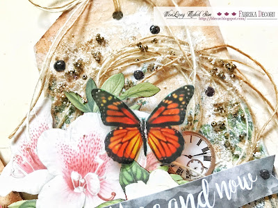
I was going through some of the Fabrika Decoru's paper collection that I had and I realized I had never play with the Botany Summer Collection before. I was really inspired by the pretty leaves and flowers that looks so realistic!

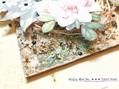
To pair off the theme, I decided to use some natural twines and butterfly transparency to enhance and create some interest. I also decided to use white gesso to create a white-washed effect to the background as well as to distress the edges with brown inks using a sponge.


Check out the glitters and the tiny beads and particles! It creates some textures to the tags and I love how the glitter sparkles under the light!


That's all for my post today. 

Isn't it simple and easy to recreate? It takes no time at all to mass-produce these tags which you can use them as a gift!

Hope you're feeling inspired to create something. :)


Monday, 19 June 2017

Happily Ever After Canvas Layout


Hey guys!

It has been a busy busy week!
Busy with academic commitments and so happy to say I'M FINALLY GRADUATING! ...actually I have one more paper to go.

I had a rough start of the year and I can only describe my life of the past few months as a series of unfortunate events (missing stuff, passing of family member, difficult group mates yada yada). Nonetheless, I'm still happy that I'm moving on to a new phase of my life, plunging myself into the reality of the world and into the working world.

Back to the main topic today! This post was almost all about beginning a new phase in life! This was a layout I did as a gift for my cousin's solemnization in January (I forgot to post oops). The whole ceremony was so heart-warming and she's the first of us to find her happily ever after! 


More close-up pics!
It has kind of a girly-punk theme to it with the magentas and blacks but I thought it was so eye-catching that it looks so sweet for her solemnization.


Made this out of Prima Marketing's paperclay and IOD moulds! 
Now I can have unlimited little angels embellishment as and when I want it!


Altered this cheap plastic frame I got out of Singapore's thrift store, Daiso. The black ink dried up in the crevices, making this frame looks like an antique! It also enhances the ridges of the frame. :)


That's all for my post today.
Hope you like what you see.
This is definitely one of my favourite creation up-to-date. 

Cheers!


Wednesday, 14 June 2017

VIDEO TUTORIAL: My Secret Garden with Fabrika Decoru's Supplies


Hi Guys!

It's Mabel here and I'm back with a video tutorial on how I created my canvas which I called it 'My Secret Garden'.


To be perfectly honest with you, this canvas started totally different from what I envisioned initially but I couldn't be happy on how it turned out. I love that the textures and the colours stand out and everything looks so good together. 


So without further ado, here's the video tutorial. I do have to apologize for the video being grainy, I had forgot to change the settings of my camera from my last use. ><


That's all for my post.
You'll realized its short, simple and easy to recreate. Hope you're inspired with what I did. 

Cheers!


Sunday, 4 June 2017

2017/18 Kaisercraft Design Team Application


Hello everyone!
As you can see from the title of this blogpost, I'm so proud to say that I'm eligible for the second round of Kaisercraft Design Team application!

They are a little different from other design teams per se as applicants would need to go through 2 rounds of application to be on their official design team. So for the second round, all eligible applicants will get their new yet-to-released supplies (see below) to play with! How cool is that!

So this is their new collection, Lilac Whispers, along with some of their existing products. When I opened up the box I was pleasantly surprised by the colour scheme. So I immediately thought of a photograph I took of my mum recently. She was 'holding' onto a lotus flower, which I thought the idea behind that photo matches the vibe that the collection gave me: graceful, elegant and exquisite. Hence, I decided to create a layout with this collection.


As the colours of this collection were on the pale side, I decided to start my layout using the corrugated cardboard as a background. It also allows me to have the textures I desired as I flipped it to the back-side and tear off pieces to reveal the ridges of the cardboard. 

To do this, simply take a tweezer and poke a hole where the gaps are, secure the tweezer to the edge of the paper and tear it off. It's actually quite therapeutic in a way. Tear off the pieces until you achieve your desired shape and exposure of the ridges. 


When you're done tearing, apply a coat of clear gesso over the areas that are flat as we will be adding colours to it later. Since cardboard is highly porous, you really don't want the colours seeping through and destroying it.

For the exposed areas, lightly brush on white gesso or white acrylic paint with a fan brush so as to highlight the ridges. 


Apply texture paste over the stencil so as to create some dimension. The stencil I'm using here is called 'Blossom'. I love that it comes in this mini size (approx 6 x 3.5 inches). It really easy to maneuver around, and great for storage. 


So this is the overall look thus far.


I went on to add colours to the layout using Kaisercraft's Kaisercolour acrylic paint in Coastal Blue, Spearmint, Antique White and Wisteria. I simply watered them down and apply it on the background in a random fashion. As acrylic paint has a opaque finished, the colours will stand out on kraft background so keep in mind that transparent-finished watercolours will not work here. 


I also used Kaisercraft cardstocks in Sage, Spearmint and Elephant Ears to die cut some of these pieces meant for layering.


To create some additional interest, I stamped on these pieces with Kaisercraft's clear stamps in Journal and Tiny Dot using a black ink pad.


Doing the same here on the background.


Now, I'm moving forward to embellishing. I really love this piece from the sticker sheet from Lilac Whispers Collection and had been trying to figure out how I can incorporate this piece into my layout. So I figured out I should trim it down to different sizes so I can stick it onto different places.

My point here is that, don't be afraid to alter your supplies according to your needs in fear that you will destroy it. Trust me, you won't. Even if the results didn't go according to what you had expected, there's always another use of it in other projects.


Yupp. So I split up the huge sticker piece and mount them on some chipboard to create dimension.


Putting together everything now. I really love love love the ephemera. It had made layering and embellishing a breeze.


Adding in the matching flowers from Kaisercraft Paper Blooms in Amethyst and Sage (mini blooms).


Love this quote I cut out from one of the paper from the same collection named Well Wishes. 

As a finishing touch, I'm gently brushing on white acrylic paint to highlight both the message and the flowers. This will help to blend in different elements.


So this is the final looks and some close-up pics! 


What do you think of this layout?

With the remaining supplies, I made a envelope holder that I desperately needed because my letters are all over the place and I need a specific item to hold them so I don't lost them. 

As you can see, I'm applying the same technique here. I created my own 'ridges' (like the corrugated cardboard) by crumpling the cardstock so that there's textures. I then highlight the crumpled lines with white acrylic paint, making them more prominent.


I have a list of supplies listed down below with links to where you can get them.
Hope you'll find that helpful. :)


That's all for this blog post. I know it was a long one, so thank you for staying through.
I hope you're inspired with what I created and is motivated to try out some of the techniques I mentioned. 

Wish me luck!


.