recent posts

Monday, 25 July 2016

July Challenge with Words and Paintery & 13arts!


For my post today, I'll be presenting my layout inspired by both Words & Paintery colour
mood board as well as 13arts' mood board for the July challenge.

To be perfectly honest, I was a little stuck with this mood board, reason being that this colour scheme probably would not be what I would go for. I guess you can say that my style usually consists of pastel or cheerful colours? Vintagy colours are really not up my alley.

Did I tell you tell that I'm currently one of the design team members for Words & Paintery too? So I will participate on W&P's mood board every month and challenge myself to all these colours! I guess its a pretty good thing to do. It sorta gives you a kick in the butt and start cracking your brains on thinking what to do.

SO GO CHALLENGE YOURSELF!!

For more information about Words & Paintery challenge, click HERE!


It's also pretty awesome that 13arts' moodboard also came out with the theme of 'Being Daring'!
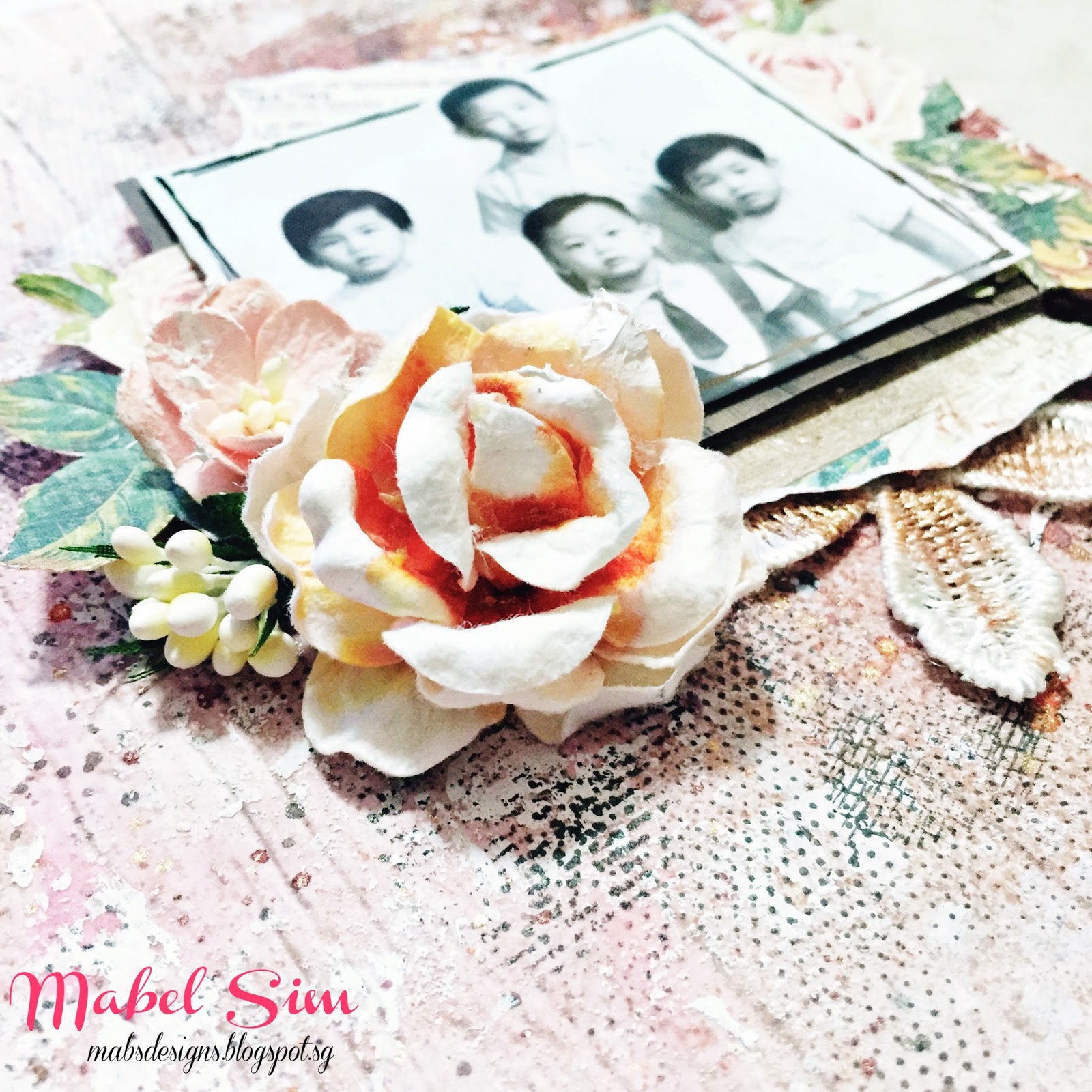
This month's challenge was hosted by Fiona. The few pictures provided on the mood board did stimulate my thinking, hence I decided to pull out my mum's old photos and decided to go head on with the theme 'vintage'!

For more info about 13arts challenge, click HERE!

Here are some close up pictures of what I have done.


And finally, the final look of the layout!!


That's all for this blog post!

I do have to apologize that I will probably not post tutorial for every single project I will be doing. Reason being that creating is my hobby and writing is really not by forte. I always get this feeling that I'm always repeating myself for every single tutorial I posted. 

BUT!
I do welcome discussions! 
If you're interested to know what products I used, or how I created certain effect and things, do comment below and I will be happy to share!

Ciao~!


Friday, 24 June 2016

2ND GDT POST FOR FABRIKA DECORU!


Hi Guys!

I'm here to share a layout I created specially for Fabrika Decoru with the sample pack they sent me. If you have read my previous post, that is the first post I created for them and this second time round, I created something that I haven done in a long time, that is something with the vintage theme!

This is the final look of what I have created. 
It was especially challenging for me as I'm used to pastel or bright colours. Albeit that, a challenge is always good once in a while right?


My layout was inspired by More than Words challenge, of which their current theme of the month is Imagina and Get Messy. To see their rules in participation, click HERE!


I first started out with prepping patterned cardstock from Fabrika Decoru's Vintage Romance Collection (FDSP-01003) with a coat of clear gesso. See how pretty the papers are? 

My layout flow was inspired by the floral piece. I especially love the hints of blue that seeps through in the midst of the floral. To enhance the flow, I tore off the edges on both sides of the floral paper, the polka dots created some contrast and added interest to the background.


To create some texture, I used Fabrika Decoru's White Texture Paste (FDTPT 150) with their Delicate Lace 1 stencil.


I also used Waves Illusion stencil (FDTR 154) with their White Sand Texture Paste (FDTPS 150) to create some variation to the textures. 

I realised this was the same combination I did for the previous layout! I unknowingly grabbed this products, I guessed I really love them! <3


When the pastes are all dried, I started applying colours. For my previous layout, I put the focus onto the sprays that was given to me, this time round, I'm putting the focus on to the acrylic paints. 

I'm using Deco Acrylic in Peach (FDAD 33), Wheat (FDAD 38) and Olive (FDAD 14).
What i did was I slightly dilute them with water to make them less intense, with the liquidity, it was easier to maneuver. As you can see, I just randomly brush it on without any rules as to where the colours should go. The only thing that you should keep in mind is that ALWAYS dry each colour before applying another. If the colours mixed together, they will tend to get muddy. 


After all that's done, I decided I need darker colours to create some contrast, hence I'm using Fabrika Decoru's Chocolate Truffle Spray Chameleon (FDSH 22) as well as to create some sprinkles with black and white sprays, as well as the 3 diluted Deco Acrylic previously used to colour the background. 

Don't worry if this looks all messy and ugly, I promised everything will be better afterwards when my centrepiece goes up! 


Now I'm starting to build my centrepiece!

I was very attracted to the lace 'doily' thing that framed Fabrika Decoru's logo. This sheet was actually the coversheet for their Shabby Dreams Collection (FDSP 01012). I was pleasantly surprised that even the coversheet was printed in weighted cardstock! Hence, I decided to fussycut out the doily and add it to my layerings.


There you go! This concoction of paper layerings were made from the Shabby Dreams collection and Vintage Romance collections. Aren't they lovely?


However, when I placed it on top of my background, I decided that my centrepiece looks too 'clean' for the background. 


Hence, I distressed the edges of my papers with brown ink and a sponge to give it a 'vintage' look.


Time for embellishments!

I added Prima Marketing's wire trims by coiling them in circles to bring the focus to the photo. I also decided that the green I wanted was buried with all these layering of colours and embellishments. Hence, I painted the wire trim with Deco Acrylic Olive. 

I used assorted flowers from Prima Marketing and my personal stash as well as randomly tangled some black sewing threads and used them as my embellishments. The black thread around different areas of the layout helps to ties in the different elements of the layout.

At the bottom of the picture, I also added some diecuts from Fabrika Decoru's Chipboard Stickers Letter of Love (FDV 001) to create some balance to my layout. As you can see, my centrepiece is slightly towards the left of the layout, hence I need some balance on the right.


So here's the final look and some close up shots! :)
All items are adhered with Fabrika Decoru's All Purpose Transparent Glue (FDGU 40).


SUPPLIES USED

FABRIKA DECORU'S PRODUCTS
(in appearance order)

OTHER PRODUCTS
Prima Marketing Flowers
Prima Marketing Clear Gesso
Prima Markeing Wire Trim
Tim Holtz Small Talk Stickers
Tim Holtz Distress Ink Pad - Vintage Photo
Tim Holtz Distressing Tool
Dylusions Ink Spray - Black Marble
Kaiser Mist - White Iridescent Spray Ink
Black Sewing Thread

That's all for this blog post!
I hope you like what I did!
Thank you for having me Fabrika Decoru!


Thursday, 9 June 2016

WEDDING BLISS! GUEST DT FOR FABRIKA DECORU!


HI GUYS!
HAPPY TO BE BACK HERE AGAIN!

I'm very happy to share the news that I'm guest-designing for Fabric Decoru this month. Fabrika Decoru is a Ukranian brand that manufactures pretty papers, paints and mediums!

I first get to know of Fabrika Decoru through their Instagram (@fabrikadecoru) where they always post gorgeous projects designed by their designers. I was attracted to their products there and then and I'm so honored that I was given this opportunity to guest design for them.

I was sent a package of their products: paper collections, assorted paints and mediums and I was so trilled (I FORGOT TO TAKE PICTURE) to be playing with them!

Prior to designing this, I personally have not tried their products. Since most of their packaging comes in Russian/Ukrainian words, I decided to take a leap of faith and not google translate the words on the packaging. To put it into simple terms, I basically have no idea what I was using. It actually makes this layout so much fun as I explore and figure out the things I was using.

So without further ado, this is the layout of which I'm sharing today.


It's actually a wedding gift for my mum's friend who's getting married real soon. We think it'll be pretty sweet to gift her with this canvas to celebrate her marriage, hence I decided to go for sweet and romantic pastel colors as the color theme of this canvas, inspired by Words & Paintery's Moodboard Click HERE to see more info!
(Psst.. you know what? I'm applying for their design team too!)


I first started out by prepping the 12x12 inches canvas with a cost of white gesso. As I have decided that I want my centerpiece to go in a horizontal direction, I used Aqua-spray in Sensuous Pink (FDSM 13) and in Fragrant Lavender (FDSM 36) to spray them in a horizontal direction as seen in the picture below. 


Once the sprays dried, I used Fabrika Decoru's Delicate Lace 1 Stencil (FDTR 184) with Texture Gel Glossy in Gentle Shabby (FDDG 03). As I said previously, I had no idea what mediums I was using as I can't read the words so I was pleasantly surprised that it turns out awesome! The gel dried to a transparent finish with a light pink tint. It's really gorgeous!

I really like their stencil as well. Whenever I'm using stencils with intricate patterns, I'm always worried that that I will somehow bent the thin plastic or smudges the inks and destroyed the pattern I was creating. I'm glad that this doesn't happen with their stencils and I love it!

I stenciled on 2 doilies on places where my photos were going to be as well as stenciling on the lace border from the same stencil on the top left and bottom right corners of the canvas to create some added interest. 


Once the gel dried, I sprayed on the third color to create some contrast. I used Fabrika Decoru's Pearl Spray in Azure Ice (FDPS 04) and sprayed mainly on the doilies part. I also used another stencil Waves Illusion (FDTR 154) with White Texture Sand Paste (FDTPS 150) to create more dimension and textures.


Once everything dried, I brushed on a light coat of white gesso on the doily part to make the pattern stand out further as well as added some 'enamel dots' created with Fabrika Decoru's Deco Acrylic in Peach by squeezing out droplets from the bottle and letting them fall directly onto the canvas. 

Deco Acrylic is heavy body paint that dries matte. The pointed tip of the bottle allows me to draw directly onto the canvas. Since it's an acrylic paint, I'm gonna dilute it and paint it in the future to see what results it may bring me! 


 Now that the background is done, I proceed to building layers for my centerpiece! 

I was given the Shabby Dreams Collection (FDSP-01012) which consist of 10 sheets of 12x12 inches patterned papers. I cut them down into assorted sizes and started layering them. I also added some scraps from my personal stash to create a contrast of colors. I chose to distress edges of some of the paper with Prima Marketing's Distressing tool, though you can always create the same effect with a pair of scissors.


Shabby Dreams Collection also comes with a sheet of patterned papers that's awesome for fussy cutting! I cut out some laces and flowers and layered them among the papers. I also started embellishing with assorted flowers from Prima Marketing and from my personal stash. 

All items on this canvas are adhered with Fabrika Decoru's All-Purpose Transparent Glue.


An awesome thing about getting flowers that are white is that you can always alter them into any color you desire.In this case, I simply sprayed on Aqua Spray in Sensuous Pink (FDSM 13) and a new look was created! I really like this line of sprays as the colors are not super intense, it's perfect to spray directly on flowers and canvas. I personally does not like to spray directly onto objects as I think it's difficult to control the colors that way. With this line of spray, I'm glad I can sprayed on directly as the colors are light.


I had cut up pieces of laces and randomly placed them around the papers. I colored them with Aqua Spray in Fragrant Lavender (FDSM 36) and in Sensuous Pink (FDSM 13) by lightly dabbing them with a brush. Since lace are made of cloth, the colors will spread and blend, giving it a natural look.


I've also created some enamel dots with Fabrika Decoru's Dove-Colored Dots, Deco Glaze in Fuchsia (FDCG 04) and Deco Glaze in Aquamarine (FDCG 10) by lining them up on a piece of waxed paper. I used waxed paper such that it will adhere to the paper and it will be easier to peel off. You can peel off just what you need and keep the piece of waxed paper for future usage!

Dove-Colored Dots is more suitable to make enamel dots as it has heavier body hence it's more dimensional and it dries opaque. Deco Glaze on another hand is more liquid. I was fooled by it's appearance when I first squeezed it out from bottle. Since it was opaque and comes in same packaging as the Dove-Colored Dots, I conveniently thought Dove-Colored Dots and Deco Glaze are the same product (I can't read the description on the packaging!). Anyway, it's still a pleasant surprise as I still use them as enamel dots and they are more vibrant in colors so it gave the canvas a pop of colors!


I also created a mixture with Texture Gel Glossy Gentle Shabby (FDDG 03) and Deko Topping Crystal Maxi (FD-TOP 01) to create my own texture paste and applied randomly on the canvas to create some textures and added interests.


Here's the final look and some close up shots!


Supplies List

Fabrika Decoru

Others
12x12 inches Canvas
Liquitex White Gesso
Prima Marketing Forest Leaves Die
Prima Marketing Floral Lace Trim
Prima Marketing Flowers
Assorted Mulberry Flowers
Assorted Patterned Papers
Dear Lizzy Lucky Charm Thickers
Laces


That's all for this post!
I have another post with them scheduled to release end of the month, do head back here to check it out!

Seeya! :)


Wednesday, 4 May 2016

2016/17 Kaisercraft Design Team Application


I'M ONE OF THE 25 FINALISTS OF KAISERCRAFT DT APPLICATION 2016/17!!!

The feeling of opening up to your mailbox to see the congratulation email was really mind-blowing. Then the wait began for the box of mysterious supplies such that we can proceed with the second round of application. 

So here I am! 
I'm bringing you a photo tutorial this time round (it's been awhile I know). :)

Check out the supplies! There are all part of Kaisercraft's latest line of products from Boho Dreams Collection. They're being super generous with the supplies! 


This is the final look of the canvas!


This is a rather unorthodox layout for a baby girl as I would think, 
yet at the same time, I thought it was perfect. 

I made this canvas because I really like her blue little dress picturing the clear blue sky, hence blue was chosen as the primary colour. The yellow/orange I used in the background are from her headband and the pink in the flowers are from her sash. If you're a beginner, I would suggest that you try working with the colours that are already in your pictures, you will never go wrong that way. 

Bohemian styles always reminds me of feathers and dreamcatchers. I hoped the best for my dear friend's baby, hoping she'll be light and free of worries like feathers and happy as dreamcatchers retained good dreams and memories. Stay cute! :)

________________________________________________________

Let's begin with the tutorial!

I started prepping a 12x12 inches canvas with white gesso first and started painting.

I used Kaisercraft's Kaisercolour (acrylic paint) in Mango and Antique White with a sponge brush.


As you can see, I did not apply a even layer of colours. 
I wanted some contrast, hence some spots are darker. 

You can really use any type of wide brushes to create this effect, I happened to use sponge brush because it was nearest to me (Mixed Media should be free and easy! There're no right and wrong!).


Now, I'm apply modeling paste over Kaisercraft's stencil 'Feathers'. 

I had a general idea in mind of the ultimate shape I want my center piece to be. Hence, I'm aligning the feathers in such a way that I created an inverted triangle. 


To add a little interest, I pouring embossing powders in both holographic and white while the modeling paste was still damp.

Take note: Pour the embossing powders one-by-one, meaning that you should pour one of them first and shake off the excess before moving on to another. 

The sequence matter as well. Pour the one that you want to retain the most. Since most of the damp modeling paste will retain the first embossing powder than the second. For this instance, I pour holographic embossing powder first as I want the feathers to be sparkly! :)

Another important step! Always wait for your modeling paste to be dried completely before heat-setting the embossing powders, otherwise the modelling paste will start to bubble.


Once, I settled the heat-setting, I sprinkled on Kaisercraft's Iridescent Mists in Denim by tapping it with a brush. 

I find it easier to control colours (especially dark colours!) this way as I can limit the area that the colour will go to. 

As you can see in the picture, I'm spraying on water to dilute the dark sprinkles such that the colours can flow around the stencilled area.


The white embossing powder that I heat-setted previously also act as a resist, hence you can see there some white spots. I also painted a layer of Kaisercraft's Kaisercolour (acrylic paint) in Spearmint around the outer circumference of the feathers. 

The different shades of blue created by the magic of water and the white spots leave some interesting contrast to the canvas! :)


I wished there's a way so let you see how bright it sparkles!


With the background done, I proceed to embellishing my centrepiece. 

I fussy cut out the flowers from 'Wild' in Boho Dreams Collection. I highly recommend you get this patterned paper as the amount of flowers you can get from this piece of paper is WOAH! In fact, I'm gonna stock up on this paper once this collection is in my local scrapbook store.

I also randomly tore off pieces of Kaisercraft's Corrugated Cardboard and 'Wanderer' from the Boho Dreams Collection. The frame and the flower girl were also fussy cut out from 'Bohemian' of the same collection.


The leaves I used here are actually strip sticker from Oh So Lovely Collection's sticker sheet. Instead of cutting the strip sticker vertically and creating a harsh edge, I trimmed it according to the shape of the leaves. 


I'm also upping my layering game with the help of Kaisercraft's Boho Dreams Collectables. If you're a quick scrapper and don't like to spend your time fussy cutting, I highly suggest you to go for the collectables. They're awesome when you're in a rush yet in a mood to scrap. 


I'm using different baker twine in different colours and thickness to create additional interest. To bring focus to the picture, I'm circling the twines around the picture.


An important element of Mixed Media would be textures. I'm using Kaisercraft's texture stamps in Tiny Dot and Journal to create some added interest to the background yet enhancing the centrepiece as well as it sort of create a shadow around the centerpiece. 


I'm also using my palette know to swipe on some gesso to create another form of texture. The fabric of the canvas will create interesting pattern when I swiped on the gesso. This is a technique that I loved to use when working on canvas.


I also brushed on gesso on the corrugated cardboard to give it some highlights.


So here's the final look of the canvas!

I use Kaisercraft's Kaisercolour (acrylic paint) in Tropical Water as a finishing touch to the edges of the canvas and the sentiments I used are from the Oh So Lovely Sticker Sheet.


Some close-up shots!


________________________________________________________

Supplies Used

Kaisercraft
Acrylic Paint - Mango
Acrylic Paint - Antique White
Acrylic Paint - Spearmint
Acrylic Paint - Tropical Water
Iridescent Mist - Denim
Stencil - Feathers
Clear Stamp - Tiny Dot
Clear Stamp - Journal
Boho Dreams Collectables
Boho Dreams Patterned Paper - Bohemian
Boho Dreams Patterned Paper - Wanderer
Boho Dreams Patterned Paper - Wild
Boho Dreams Sticker Sheet
Oh So Lovely Sticker Sheet
12x12 inches Corrugated Cardboard

Others
12x12 inches Canvas
Liquitex White Gesso
Liquitex Modeling Paste
Ranger Holographic Embossing Powder
Stampendous White Embossing Powder
StazOn Black Inkpad
Twines

________________________________________________________

That's all for today's post!
Wish me luck! :)
#fingerscrossed


Monday, 25 July 2016

July Challenge with Words and Paintery & 13arts!


For my post today, I'll be presenting my layout inspired by both Words & Paintery colour
mood board as well as 13arts' mood board for the July challenge.

To be perfectly honest, I was a little stuck with this mood board, reason being that this colour scheme probably would not be what I would go for. I guess you can say that my style usually consists of pastel or cheerful colours? Vintagy colours are really not up my alley.

Did I tell you tell that I'm currently one of the design team members for Words & Paintery too? So I will participate on W&P's mood board every month and challenge myself to all these colours! I guess its a pretty good thing to do. It sorta gives you a kick in the butt and start cracking your brains on thinking what to do.

SO GO CHALLENGE YOURSELF!!

For more information about Words & Paintery challenge, click HERE!


It's also pretty awesome that 13arts' moodboard also came out with the theme of 'Being Daring'!
This month's challenge was hosted by Fiona. The few pictures provided on the mood board did stimulate my thinking, hence I decided to pull out my mum's old photos and decided to go head on with the theme 'vintage'!

For more info about 13arts challenge, click HERE!

Here are some close up pictures of what I have done.


And finally, the final look of the layout!!


That's all for this blog post!

I do have to apologize that I will probably not post tutorial for every single project I will be doing. Reason being that creating is my hobby and writing is really not by forte. I always get this feeling that I'm always repeating myself for every single tutorial I posted. 

BUT!
I do welcome discussions! 
If you're interested to know what products I used, or how I created certain effect and things, do comment below and I will be happy to share!

Ciao~!


Friday, 24 June 2016

2ND GDT POST FOR FABRIKA DECORU!


Hi Guys!

I'm here to share a layout I created specially for Fabrika Decoru with the sample pack they sent me. If you have read my previous post, that is the first post I created for them and this second time round, I created something that I haven done in a long time, that is something with the vintage theme!

This is the final look of what I have created. 
It was especially challenging for me as I'm used to pastel or bright colours. Albeit that, a challenge is always good once in a while right?


My layout was inspired by More than Words challenge, of which their current theme of the month is Imagina and Get Messy. To see their rules in participation, click HERE!


I first started out with prepping patterned cardstock from Fabrika Decoru's Vintage Romance Collection (FDSP-01003) with a coat of clear gesso. See how pretty the papers are? 

My layout flow was inspired by the floral piece. I especially love the hints of blue that seeps through in the midst of the floral. To enhance the flow, I tore off the edges on both sides of the floral paper, the polka dots created some contrast and added interest to the background.


To create some texture, I used Fabrika Decoru's White Texture Paste (FDTPT 150) with their Delicate Lace 1 stencil.


I also used Waves Illusion stencil (FDTR 154) with their White Sand Texture Paste (FDTPS 150) to create some variation to the textures. 

I realised this was the same combination I did for the previous layout! I unknowingly grabbed this products, I guessed I really love them! <3


When the pastes are all dried, I started applying colours. For my previous layout, I put the focus onto the sprays that was given to me, this time round, I'm putting the focus on to the acrylic paints. 

I'm using Deco Acrylic in Peach (FDAD 33), Wheat (FDAD 38) and Olive (FDAD 14).
What i did was I slightly dilute them with water to make them less intense, with the liquidity, it was easier to maneuver. As you can see, I just randomly brush it on without any rules as to where the colours should go. The only thing that you should keep in mind is that ALWAYS dry each colour before applying another. If the colours mixed together, they will tend to get muddy. 


After all that's done, I decided I need darker colours to create some contrast, hence I'm using Fabrika Decoru's Chocolate Truffle Spray Chameleon (FDSH 22) as well as to create some sprinkles with black and white sprays, as well as the 3 diluted Deco Acrylic previously used to colour the background. 

Don't worry if this looks all messy and ugly, I promised everything will be better afterwards when my centrepiece goes up! 


Now I'm starting to build my centrepiece!

I was very attracted to the lace 'doily' thing that framed Fabrika Decoru's logo. This sheet was actually the coversheet for their Shabby Dreams Collection (FDSP 01012). I was pleasantly surprised that even the coversheet was printed in weighted cardstock! Hence, I decided to fussycut out the doily and add it to my layerings.


There you go! This concoction of paper layerings were made from the Shabby Dreams collection and Vintage Romance collections. Aren't they lovely?


However, when I placed it on top of my background, I decided that my centrepiece looks too 'clean' for the background. 


Hence, I distressed the edges of my papers with brown ink and a sponge to give it a 'vintage' look.


Time for embellishments!

I added Prima Marketing's wire trims by coiling them in circles to bring the focus to the photo. I also decided that the green I wanted was buried with all these layering of colours and embellishments. Hence, I painted the wire trim with Deco Acrylic Olive. 

I used assorted flowers from Prima Marketing and my personal stash as well as randomly tangled some black sewing threads and used them as my embellishments. The black thread around different areas of the layout helps to ties in the different elements of the layout.

At the bottom of the picture, I also added some diecuts from Fabrika Decoru's Chipboard Stickers Letter of Love (FDV 001) to create some balance to my layout. As you can see, my centrepiece is slightly towards the left of the layout, hence I need some balance on the right.


So here's the final look and some close up shots! :)
All items are adhered with Fabrika Decoru's All Purpose Transparent Glue (FDGU 40).


SUPPLIES USED

FABRIKA DECORU'S PRODUCTS
(in appearance order)

OTHER PRODUCTS
Prima Marketing Flowers
Prima Marketing Clear Gesso
Prima Markeing Wire Trim
Tim Holtz Small Talk Stickers
Tim Holtz Distress Ink Pad - Vintage Photo
Tim Holtz Distressing Tool
Dylusions Ink Spray - Black Marble
Kaiser Mist - White Iridescent Spray Ink
Black Sewing Thread

That's all for this blog post!
I hope you like what I did!
Thank you for having me Fabrika Decoru!


Thursday, 9 June 2016

WEDDING BLISS! GUEST DT FOR FABRIKA DECORU!


HI GUYS!
HAPPY TO BE BACK HERE AGAIN!

I'm very happy to share the news that I'm guest-designing for Fabric Decoru this month. Fabrika Decoru is a Ukranian brand that manufactures pretty papers, paints and mediums!

I first get to know of Fabrika Decoru through their Instagram (@fabrikadecoru) where they always post gorgeous projects designed by their designers. I was attracted to their products there and then and I'm so honored that I was given this opportunity to guest design for them.

I was sent a package of their products: paper collections, assorted paints and mediums and I was so trilled (I FORGOT TO TAKE PICTURE) to be playing with them!

Prior to designing this, I personally have not tried their products. Since most of their packaging comes in Russian/Ukrainian words, I decided to take a leap of faith and not google translate the words on the packaging. To put it into simple terms, I basically have no idea what I was using. It actually makes this layout so much fun as I explore and figure out the things I was using.

So without further ado, this is the layout of which I'm sharing today.


It's actually a wedding gift for my mum's friend who's getting married real soon. We think it'll be pretty sweet to gift her with this canvas to celebrate her marriage, hence I decided to go for sweet and romantic pastel colors as the color theme of this canvas, inspired by Words & Paintery's Moodboard Click HERE to see more info!
(Psst.. you know what? I'm applying for their design team too!)


I first started out by prepping the 12x12 inches canvas with a cost of white gesso. As I have decided that I want my centerpiece to go in a horizontal direction, I used Aqua-spray in Sensuous Pink (FDSM 13) and in Fragrant Lavender (FDSM 36) to spray them in a horizontal direction as seen in the picture below. 


Once the sprays dried, I used Fabrika Decoru's Delicate Lace 1 Stencil (FDTR 184) with Texture Gel Glossy in Gentle Shabby (FDDG 03). As I said previously, I had no idea what mediums I was using as I can't read the words so I was pleasantly surprised that it turns out awesome! The gel dried to a transparent finish with a light pink tint. It's really gorgeous!

I really like their stencil as well. Whenever I'm using stencils with intricate patterns, I'm always worried that that I will somehow bent the thin plastic or smudges the inks and destroyed the pattern I was creating. I'm glad that this doesn't happen with their stencils and I love it!

I stenciled on 2 doilies on places where my photos were going to be as well as stenciling on the lace border from the same stencil on the top left and bottom right corners of the canvas to create some added interest. 


Once the gel dried, I sprayed on the third color to create some contrast. I used Fabrika Decoru's Pearl Spray in Azure Ice (FDPS 04) and sprayed mainly on the doilies part. I also used another stencil Waves Illusion (FDTR 154) with White Texture Sand Paste (FDTPS 150) to create more dimension and textures.


Once everything dried, I brushed on a light coat of white gesso on the doily part to make the pattern stand out further as well as added some 'enamel dots' created with Fabrika Decoru's Deco Acrylic in Peach by squeezing out droplets from the bottle and letting them fall directly onto the canvas. 

Deco Acrylic is heavy body paint that dries matte. The pointed tip of the bottle allows me to draw directly onto the canvas. Since it's an acrylic paint, I'm gonna dilute it and paint it in the future to see what results it may bring me! 


 Now that the background is done, I proceed to building layers for my centerpiece! 

I was given the Shabby Dreams Collection (FDSP-01012) which consist of 10 sheets of 12x12 inches patterned papers. I cut them down into assorted sizes and started layering them. I also added some scraps from my personal stash to create a contrast of colors. I chose to distress edges of some of the paper with Prima Marketing's Distressing tool, though you can always create the same effect with a pair of scissors.


Shabby Dreams Collection also comes with a sheet of patterned papers that's awesome for fussy cutting! I cut out some laces and flowers and layered them among the papers. I also started embellishing with assorted flowers from Prima Marketing and from my personal stash. 

All items on this canvas are adhered with Fabrika Decoru's All-Purpose Transparent Glue.


An awesome thing about getting flowers that are white is that you can always alter them into any color you desire.In this case, I simply sprayed on Aqua Spray in Sensuous Pink (FDSM 13) and a new look was created! I really like this line of sprays as the colors are not super intense, it's perfect to spray directly on flowers and canvas. I personally does not like to spray directly onto objects as I think it's difficult to control the colors that way. With this line of spray, I'm glad I can sprayed on directly as the colors are light.


I had cut up pieces of laces and randomly placed them around the papers. I colored them with Aqua Spray in Fragrant Lavender (FDSM 36) and in Sensuous Pink (FDSM 13) by lightly dabbing them with a brush. Since lace are made of cloth, the colors will spread and blend, giving it a natural look.


I've also created some enamel dots with Fabrika Decoru's Dove-Colored Dots, Deco Glaze in Fuchsia (FDCG 04) and Deco Glaze in Aquamarine (FDCG 10) by lining them up on a piece of waxed paper. I used waxed paper such that it will adhere to the paper and it will be easier to peel off. You can peel off just what you need and keep the piece of waxed paper for future usage!

Dove-Colored Dots is more suitable to make enamel dots as it has heavier body hence it's more dimensional and it dries opaque. Deco Glaze on another hand is more liquid. I was fooled by it's appearance when I first squeezed it out from bottle. Since it was opaque and comes in same packaging as the Dove-Colored Dots, I conveniently thought Dove-Colored Dots and Deco Glaze are the same product (I can't read the description on the packaging!). Anyway, it's still a pleasant surprise as I still use them as enamel dots and they are more vibrant in colors so it gave the canvas a pop of colors!


I also created a mixture with Texture Gel Glossy Gentle Shabby (FDDG 03) and Deko Topping Crystal Maxi (FD-TOP 01) to create my own texture paste and applied randomly on the canvas to create some textures and added interests.


Here's the final look and some close up shots!


Supplies List

Fabrika Decoru

Others
12x12 inches Canvas
Liquitex White Gesso
Prima Marketing Forest Leaves Die
Prima Marketing Floral Lace Trim
Prima Marketing Flowers
Assorted Mulberry Flowers
Assorted Patterned Papers
Dear Lizzy Lucky Charm Thickers
Laces


That's all for this post!
I have another post with them scheduled to release end of the month, do head back here to check it out!

Seeya! :)


Wednesday, 4 May 2016

2016/17 Kaisercraft Design Team Application


I'M ONE OF THE 25 FINALISTS OF KAISERCRAFT DT APPLICATION 2016/17!!!

The feeling of opening up to your mailbox to see the congratulation email was really mind-blowing. Then the wait began for the box of mysterious supplies such that we can proceed with the second round of application. 

So here I am! 
I'm bringing you a photo tutorial this time round (it's been awhile I know). :)

Check out the supplies! There are all part of Kaisercraft's latest line of products from Boho Dreams Collection. They're being super generous with the supplies! 


This is the final look of the canvas!


This is a rather unorthodox layout for a baby girl as I would think, 
yet at the same time, I thought it was perfect. 

I made this canvas because I really like her blue little dress picturing the clear blue sky, hence blue was chosen as the primary colour. The yellow/orange I used in the background are from her headband and the pink in the flowers are from her sash. If you're a beginner, I would suggest that you try working with the colours that are already in your pictures, you will never go wrong that way. 

Bohemian styles always reminds me of feathers and dreamcatchers. I hoped the best for my dear friend's baby, hoping she'll be light and free of worries like feathers and happy as dreamcatchers retained good dreams and memories. Stay cute! :)

________________________________________________________

Let's begin with the tutorial!

I started prepping a 12x12 inches canvas with white gesso first and started painting.

I used Kaisercraft's Kaisercolour (acrylic paint) in Mango and Antique White with a sponge brush.


As you can see, I did not apply a even layer of colours. 
I wanted some contrast, hence some spots are darker. 

You can really use any type of wide brushes to create this effect, I happened to use sponge brush because it was nearest to me (Mixed Media should be free and easy! There're no right and wrong!).


Now, I'm apply modeling paste over Kaisercraft's stencil 'Feathers'. 

I had a general idea in mind of the ultimate shape I want my center piece to be. Hence, I'm aligning the feathers in such a way that I created an inverted triangle. 


To add a little interest, I pouring embossing powders in both holographic and white while the modeling paste was still damp.

Take note: Pour the embossing powders one-by-one, meaning that you should pour one of them first and shake off the excess before moving on to another. 

The sequence matter as well. Pour the one that you want to retain the most. Since most of the damp modeling paste will retain the first embossing powder than the second. For this instance, I pour holographic embossing powder first as I want the feathers to be sparkly! :)

Another important step! Always wait for your modeling paste to be dried completely before heat-setting the embossing powders, otherwise the modelling paste will start to bubble.


Once, I settled the heat-setting, I sprinkled on Kaisercraft's Iridescent Mists in Denim by tapping it with a brush. 

I find it easier to control colours (especially dark colours!) this way as I can limit the area that the colour will go to. 

As you can see in the picture, I'm spraying on water to dilute the dark sprinkles such that the colours can flow around the stencilled area.


The white embossing powder that I heat-setted previously also act as a resist, hence you can see there some white spots. I also painted a layer of Kaisercraft's Kaisercolour (acrylic paint) in Spearmint around the outer circumference of the feathers. 

The different shades of blue created by the magic of water and the white spots leave some interesting contrast to the canvas! :)


I wished there's a way so let you see how bright it sparkles!


With the background done, I proceed to embellishing my centrepiece. 

I fussy cut out the flowers from 'Wild' in Boho Dreams Collection. I highly recommend you get this patterned paper as the amount of flowers you can get from this piece of paper is WOAH! In fact, I'm gonna stock up on this paper once this collection is in my local scrapbook store.

I also randomly tore off pieces of Kaisercraft's Corrugated Cardboard and 'Wanderer' from the Boho Dreams Collection. The frame and the flower girl were also fussy cut out from 'Bohemian' of the same collection.


The leaves I used here are actually strip sticker from Oh So Lovely Collection's sticker sheet. Instead of cutting the strip sticker vertically and creating a harsh edge, I trimmed it according to the shape of the leaves. 


I'm also upping my layering game with the help of Kaisercraft's Boho Dreams Collectables. If you're a quick scrapper and don't like to spend your time fussy cutting, I highly suggest you to go for the collectables. They're awesome when you're in a rush yet in a mood to scrap. 


I'm using different baker twine in different colours and thickness to create additional interest. To bring focus to the picture, I'm circling the twines around the picture.


An important element of Mixed Media would be textures. I'm using Kaisercraft's texture stamps in Tiny Dot and Journal to create some added interest to the background yet enhancing the centrepiece as well as it sort of create a shadow around the centerpiece. 


I'm also using my palette know to swipe on some gesso to create another form of texture. The fabric of the canvas will create interesting pattern when I swiped on the gesso. This is a technique that I loved to use when working on canvas.


I also brushed on gesso on the corrugated cardboard to give it some highlights.


So here's the final look of the canvas!

I use Kaisercraft's Kaisercolour (acrylic paint) in Tropical Water as a finishing touch to the edges of the canvas and the sentiments I used are from the Oh So Lovely Sticker Sheet.


Some close-up shots!


________________________________________________________

Supplies Used

Kaisercraft
Acrylic Paint - Mango
Acrylic Paint - Antique White
Acrylic Paint - Spearmint
Acrylic Paint - Tropical Water
Iridescent Mist - Denim
Stencil - Feathers
Clear Stamp - Tiny Dot
Clear Stamp - Journal
Boho Dreams Collectables
Boho Dreams Patterned Paper - Bohemian
Boho Dreams Patterned Paper - Wanderer
Boho Dreams Patterned Paper - Wild
Boho Dreams Sticker Sheet
Oh So Lovely Sticker Sheet
12x12 inches Corrugated Cardboard

Others
12x12 inches Canvas
Liquitex White Gesso
Liquitex Modeling Paste
Ranger Holographic Embossing Powder
Stampendous White Embossing Powder
StazOn Black Inkpad
Twines

________________________________________________________

That's all for today's post!
Wish me luck! :)
#fingerscrossed


.