For this blog post, everything was inspired by Blue Fern Studios April Sketch Challenge.
Click here for more info!
The thing about my usual style whenever I do a sketch challenge was that I will take a look at the sketch and try to remember the stuff that caught my eyes. I tend to do this as I do not want to replicate the sketch exactly and may look similar to other challenge participants. But. BUT I THINK I'M REALLY OFF THE MARK THIS TIME!!! :((
The thing I remember about this layout was that the focal point should be going from up to down vertically and I'm supposed to have some form of stripes behind my photo, keeping in mind that I need to use Blue Fern Studios products.
This is the moodboard that we set as a STYD Challenge. STYD Challenge is actually a challenge that we frequently have among my crafty friends that I befriended in a local craft store. Everytime we managed to meet up, we will have a STYD Challenge with the photo that we took during our meetup.
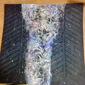
Since my previous few projects are pretty sweet and pastel, I decided to go for some stronger colours. Hence I used this Kaisercraft paper from the Blue Bay Collection. As the background colour was too strong, I gesso-ed the centre portion so I could add some colours. :)
I do not know why I failed to notice that the gesso-ed part was off-center until I'm blogging about this now. Oh well, what's done is done.
Anyway, the mists I used here are mainly from Tattered Angels in Mustard Seed and LED Red as well as 13 Arts' Pastel Cobalt and Teal and Lindy's Stamp Gang's Witch Portion Purple. As you can see, I actually let some of the colours flow, adding some dripping effect. I also watered down my black and white gesso to create some splatter.
Next, I grab my Tim Holtz Flourish Stencil and swipe on a coat of modelling paste. Before the modelling paste dries, I quickly poured on some black embossing powder. The wet embossing paste will trap the embossing powder. The trick to this method was to be patient. I would recommend you to wait for the modelling paste to be dried before heating your embossing powder, otherwise, you might get some bubbles on your modelling paste, and your embossing powder won't look as smooth.
Then it's time to embellish! As my colours are rather strong, I went ahead with a photo with muted colours. My layering papers are from Blue Fern Studios Ombre Dreams and the 'Friends' Chipboard is from Blue Fern Studios as well. I also randomly grab some cords and circle it around my photo to give it some interest. :)
And this is the final look of my layout.
It's rather different from the sketch, I really got too carried away that I somehow forgot about the sketch. But if it's not askew and the photo is a bit bigger, I would have thought that this layout is pretty perfect. #ohwell
Most of the flowers I used here are from Prima Marketing, with the exception of the tiny blue flowers from Petaloo and the diecuts from Maggie Holmes.
My sentiment is from Tim Holtz Phrases Sticker Book.
Here are some close-up shots.
I mixed some beads with matt medium and applied it on random places on the layout as details.
That's all for today's post.
Please leave some love in the comment section below!
THANKS! <3


No comments:
Post a Comment