Things had been really busy for me those past few weeks. I barely had the time to scrap and to blog about it! And I finally got some time to catch up on my blog post. Haha.
The photo I used in this layout was given to me by my roommate when we lived in Germany after we returned to Singapore. This photo stayed in my wallet ever since then (I think partly because I'm lazy to clean my wallet haha). I think he has got to be favourite person I've met there so this layout is dedicated to him.
Anyway, this sketch is from Let's Get Sketchy Challenge blog where I am designing for. I particularly like this sketch as it is very generic and allows a lot of room for creativity.
I first started out with a piece of Teresa Collins patterned paper from one of her old collections. I primed it with a coat of clear gesso and then did some stencilling with 13 arts pastel spray as seen in the picture as well as a diluted version of Kaisercraft's acrylic paint in Mint in a spray bottle.
The fun thing about this stencilling was that I did not use a stencil. Instead, I used a plastic grid meant for stitching. You can really just grab and use anything you have around your environment to craft.
I actually let the inks pooled a little bit as well as letting it flow to create that dripping effect.
As you can see from the sketch, there're some circle elements. Instead of cutting circles and layering it behind my main piece, I decided to dilute my black gesso and using the rims of bottle caps, cups etc to create circles. I also added some splatter with the left over diluted black gesso.
Then I started embellishing! Chipboard is a diecut from Sizzix Tim Holtz Flourish Bigz Dies. I applied a coat of glossy accent on top of it after colouring it with some diluted Kaisercraft's Mint acrylic paint. I also layered my photos with pieces of scraps from my old projects. I also used some film transparencies from Tim Holtz.
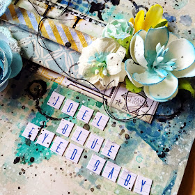
This is the final look of my layout! I loved that the whole layout is boyish yet elegant. I chose blue as my theme in the first place as I remembered Joel having the bluest eyes I've ever seen. I also forgot to mentioned that most of the flowers I used are from Prima Marketing.
Here are some close-ups. :)
I added some black strings for added interests. I also gesso-ed my flowers to help them blend in better.
Alphabets stickers from Jillibean Soup.
Added some Ranger's Clear Crackle Accent for details.
That's all for today.
Please stay tuned for more blog post coming real soon!
Please leave some love for me as well. Seeya! :)


No comments:
Post a Comment