recent posts

Monday, 15 June 2015

LGS & SATW Challenge


Hi Guys!

I'm back again with a real simple layout this time round with minimum mediums and a lot of paper matching scrapbooking.

My layout is inspired by this sketch from Let's Get Sketchy. I really loved this week's layout. I think the design is simple yet refreshing. There're simply so many elements you can play with.


As you can see later on, some of my choices of embellishments and colour scheme are inspired by this moodboard from Scrap Around the World which you can find more information here


I pulled out Amy Tangerine's Stitched Collection Map of my Heart paper and trimmed it down to the triangles I wanted. I popped them up with cardboard pieces (to save of pop-dots, hehe). I layered it with Crate Paper's Confetti Collection Cloud Nine paper. As for the papers I layered beneath my photos, they are from my scraps stash, I'm sorry I can't seem to remember which brands they're from. 


The sketch has a horizontal element, to incorporate that in my layout without hiding the triangle details, I decided to cut some glitter banners from my American Crafts Glitter Cardstock. I found out that the easiest way to cut a banner was to first cut a slit in the middle, depending on how deep you want the 'V' for your banner to be, then followed by cutting the from the corner of the banner to the end of the slit. I think this way is the easiest to ensure you get proportionate banner. 


And this is the final look of this layout!

Like I said earlier, there really isn't much techniques to this layout. 


I first cut out triangles because I wanted to create my own chevron pattern as I don't have any patterned papers with chevron patterned that fit in the moodboard. I did some stamping with Kaisercraft Tiny Dot stamps (MY FAV!) to add some interest to it as well as diluting some black gesso and splattered it on my layout. 

I also used Mambi stickers as embellishment as inspired by the chalkboard on the SATW moodboard.


I then create my own rosettes using rosettes dies from Sizzix Tim Holtz line. I think it's really one of the MUST-HAVES dies if you have a die-cutting machine. It can create 2 sizes rosettes at once and rosettes are perfect for any types of projects. 

I used mainly Prima and Petaloo flowers in this project. I also layered sequins from Teresa Collins with dew drops from Robin's Nest.


I think dew drops are awesome as embellishments. They come in a bottle and it's rather inexpensive given the amount inside the bottle. 

I also used Echo Park stickers from the Here & Now collection as my sentiments. 


That's all for this week's post.

Thanks for reading! Leave some comments to let me know what you think! :)


Saturday, 6 June 2015

Let's Get Sketchy & Meg's Garden


So I was a bit late for this post. The procrastination bug just got to me and succumbed to it. :(

Anyway, this layout was for LGS's May Sketch Challenge as well as my application for Meg's Garden DT.


When I first saw this sketch, I felt slightly panicky as the whole layout seems rather complicated. I had some problems starting this, but once I plunged in, everything just comes naturally.

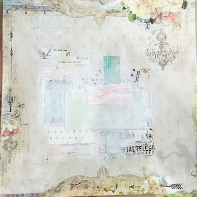
I first pulled out a piece of patterned paper from Blue Fern Studios Love Story Collection named the Grand Ball. I cut up strips of leftover patterned paper in random sizes. I didn't really care for the colours as I know I will be apply a coat of gesso over it, and the white gesso will mute down the clashing colours. 

The layering of papers gives some textures to the layout. The inks/paints that I applied afterwards will also moved around the edges of these papers. 


To create this look, I used a variety of mediums such as acrylic paints and mica powders. 

I diluted Kaisercraft's acrylic paint in Spearmint with lots of water such that I can spray from a spray bottle. Make sure you clean the spray nozzle after usage, cos the paint can dry up and clog the spray bottle. 

I also used Lindy's Stamp Gang's Starburst spray in French Lilac Violet as well as Tattered Angel's Patina Blue. When using dark colours, it's not recommended to spray directly onto your project unless that's the look you want to achieved. Gently wet the areas you want to apply the colours with a coat of water, uncapped the coloured spray bottle, and gently flick the colours on your project. You can also go back in with a wet brush to manoeuvre the colours around. I preferred to do it this way as I can control the intensity of the colours. 

I mixed Prima Finnabair's Gold mica powder with water to create a shimmery gold watercolour. If I applied my gold water colour directly on wet purple water colour, I would probably get yucky murky colours, which was not what I want. Hence to prevent that from happening, dry your paint before applying another. 


To create more details, I decided to do some stamping with Prima's Epiphany and Cigar Box Collection, as well as Kaisercraft's Tiny Dots stamp with my Stazon Black ink pad.

I also go back in with 13 arts' Cobalt Pastel spray as I felt that the colours are not intense enough previously.


I also decided to colour the stamped images with Marion Smith's Mica powders in Dusty Rose. Dusty rose mica powder gives off a gold shimmer and it's really shimmery!


I also added a thin coat of Ranger's Clear Crackle paint to add some cracked details on the images. 


Here's the final look of this layout! 

Flowers I used are from Prima. I also die cut and rolled up some paper flowers from Die-namics. 


Here are some close-up shots. :)


I altered some flowers with Silks glaze in African Jade and Pink Grapefruit.


The intricate paper is from Heidi Swapp and the sticker strips are from Tim Holtz.


That's all for this post. 

Have a great weekend everyone!


Monday, 15 June 2015

LGS & SATW Challenge


Hi Guys!

I'm back again with a real simple layout this time round with minimum mediums and a lot of paper matching scrapbooking.

My layout is inspired by this sketch from Let's Get Sketchy. I really loved this week's layout. I think the design is simple yet refreshing. There're simply so many elements you can play with.


As you can see later on, some of my choices of embellishments and colour scheme are inspired by this moodboard from Scrap Around the World which you can find more information here


I pulled out Amy Tangerine's Stitched Collection Map of my Heart paper and trimmed it down to the triangles I wanted. I popped them up with cardboard pieces (to save of pop-dots, hehe). I layered it with Crate Paper's Confetti Collection Cloud Nine paper. As for the papers I layered beneath my photos, they are from my scraps stash, I'm sorry I can't seem to remember which brands they're from. 


The sketch has a horizontal element, to incorporate that in my layout without hiding the triangle details, I decided to cut some glitter banners from my American Crafts Glitter Cardstock. I found out that the easiest way to cut a banner was to first cut a slit in the middle, depending on how deep you want the 'V' for your banner to be, then followed by cutting the from the corner of the banner to the end of the slit. I think this way is the easiest to ensure you get proportionate banner. 


And this is the final look of this layout!

Like I said earlier, there really isn't much techniques to this layout. 


I first cut out triangles because I wanted to create my own chevron pattern as I don't have any patterned papers with chevron patterned that fit in the moodboard. I did some stamping with Kaisercraft Tiny Dot stamps (MY FAV!) to add some interest to it as well as diluting some black gesso and splattered it on my layout. 

I also used Mambi stickers as embellishment as inspired by the chalkboard on the SATW moodboard.


I then create my own rosettes using rosettes dies from Sizzix Tim Holtz line. I think it's really one of the MUST-HAVES dies if you have a die-cutting machine. It can create 2 sizes rosettes at once and rosettes are perfect for any types of projects. 

I used mainly Prima and Petaloo flowers in this project. I also layered sequins from Teresa Collins with dew drops from Robin's Nest.


I think dew drops are awesome as embellishments. They come in a bottle and it's rather inexpensive given the amount inside the bottle. 

I also used Echo Park stickers from the Here & Now collection as my sentiments. 


That's all for this week's post.

Thanks for reading! Leave some comments to let me know what you think! :)


Saturday, 6 June 2015

Let's Get Sketchy & Meg's Garden


So I was a bit late for this post. The procrastination bug just got to me and succumbed to it. :(

Anyway, this layout was for LGS's May Sketch Challenge as well as my application for Meg's Garden DT.


When I first saw this sketch, I felt slightly panicky as the whole layout seems rather complicated. I had some problems starting this, but once I plunged in, everything just comes naturally.

I first pulled out a piece of patterned paper from Blue Fern Studios Love Story Collection named the Grand Ball. I cut up strips of leftover patterned paper in random sizes. I didn't really care for the colours as I know I will be apply a coat of gesso over it, and the white gesso will mute down the clashing colours. 

The layering of papers gives some textures to the layout. The inks/paints that I applied afterwards will also moved around the edges of these papers. 


To create this look, I used a variety of mediums such as acrylic paints and mica powders. 

I diluted Kaisercraft's acrylic paint in Spearmint with lots of water such that I can spray from a spray bottle. Make sure you clean the spray nozzle after usage, cos the paint can dry up and clog the spray bottle. 

I also used Lindy's Stamp Gang's Starburst spray in French Lilac Violet as well as Tattered Angel's Patina Blue. When using dark colours, it's not recommended to spray directly onto your project unless that's the look you want to achieved. Gently wet the areas you want to apply the colours with a coat of water, uncapped the coloured spray bottle, and gently flick the colours on your project. You can also go back in with a wet brush to manoeuvre the colours around. I preferred to do it this way as I can control the intensity of the colours. 

I mixed Prima Finnabair's Gold mica powder with water to create a shimmery gold watercolour. If I applied my gold water colour directly on wet purple water colour, I would probably get yucky murky colours, which was not what I want. Hence to prevent that from happening, dry your paint before applying another. 


To create more details, I decided to do some stamping with Prima's Epiphany and Cigar Box Collection, as well as Kaisercraft's Tiny Dots stamp with my Stazon Black ink pad.

I also go back in with 13 arts' Cobalt Pastel spray as I felt that the colours are not intense enough previously.


I also decided to colour the stamped images with Marion Smith's Mica powders in Dusty Rose. Dusty rose mica powder gives off a gold shimmer and it's really shimmery!


I also added a thin coat of Ranger's Clear Crackle paint to add some cracked details on the images. 


Here's the final look of this layout! 

Flowers I used are from Prima. I also die cut and rolled up some paper flowers from Die-namics. 


Here are some close-up shots. :)


I altered some flowers with Silks glaze in African Jade and Pink Grapefruit.


The intricate paper is from Heidi Swapp and the sticker strips are from Tim Holtz.


That's all for this post. 

Have a great weekend everyone!


.